Law of Continuation

Overview Understanding how consumers visually perceive and process information is critical for building seamless and intuitive digital experiences. One of the important ideas that aids in this endeavour is the Law of Continuation, a fundamental conce...
Overview
Understanding how consumers visually perceive and process information is critical for building seamless and intuitive digital experiences. One of the important ideas that aids in this endeavour is the Law of Continuation, a fundamental concept drawn from Gestalt psychology. According to this notion, the human eye follows a continuous path or direction when seeing a design, even if elements are separated. Using the Law of Continuation, designers may direct users' attention, create natural reading flows, and increase usability.
In this post, we will look at the significance of the Law of Continuation in UX/UI design, how it affects user behavior, and practical implementations using real-world examples
What is the Law of Continuation?
The Law of Continuation, also known as the Principle of Good Continuation, states that our eyes naturally follow lines, curves, or sequences in a smooth and continuous manner. When confronted with aligned items or pieces, the brain views them as part of a continuous movement rather than individual components.
For example, if a bunch of dots is organised in a curved or straight line, our brain naturally joins them, experiencing a unified, flowing structure rather than individual dots. The capacity to recognize continuity reduces cognitive burden and improves readability in design
Why is the Law of Continuation important in UX/UI design?
The Law of continuity is extremely important in UX/UI design since it ensures that
User focus is efficiently directed: by organising items in a way that naturally leads the eye, designers can control the user's visual journey.
Navigation becomes intuitive, allowing users to quickly follow the intended path without extra confusion or effort.
Aesthetic appeal is improved: consistent flow in design leads to a clean and attractive interface, making the experience more enjoyable.
Readability improves: proper alignment makes text and other visual elements easier to understand.
Conversions increase: By efficiently leading users to CTAs (Call-To-Actions), businesses can improve engagement and conversions.
Applying the Law of Continuation in UX/UI Design
1. Using Flowing Elements to Guide Users Navigation
A well-structured interface should organically guide users from one element to the next. Designers can accomplish this by aligning navigation menus, buttons, or information sections along a defined path.
Example:
Websites frequently employ horizontal navigation bars that position menu selections in a row, making it simple for visitors to follow and select their next action without disrupting visual continuity.
2. Use Lines and Arrows to Indicate Direction
Lines, arrows, and visual indicators provide directional clues to help users travel more easily. This technique is often utilised in onboarding experiences or interactive product guides.
Example:
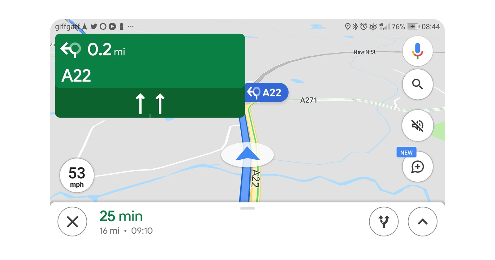
Google Maps uses directional arrows to direct users on their intended journey, reinforcing the sense of visual continuity.

3. Aligning Text and Content Blocks to Improve Readability
When paragraphs, headlines, and images are arranged, they are easier to read and understand.
Example:
News websites, such as The New York Times, use justified text and aligned content sections to create a pleasant reading experience.
4. A smooth scrolling experience on websites and apps.
Scrolling effects are commonly used on websites and mobile apps to create a sense of natural flow. When material loads dynamically or scrolls smoothly, people can ingest information more easily.
Example:
Apple's product pages leverage horizontal and vertical scrolling to fluidly move between different parts, keeping users engaged.
5. Visual Consistency in Call-to-Action (CTA) Placement
CTAs should be placed in areas that naturally follow the user's reading or scrolling behaviour, increasing the likelihood of engagement.
Example:
Amazon displays the "Add to Cart" button among product descriptions and photographs, making it a natural extension of the buying experience.
Best Practices for Applying the Law of Continuation
Use Alignment and Spacing Effectively: Make sure pieces are structured in a way that directs users rationally through the interface.
Subtle Indicators: Use arrows, lines, or gradients to draw the user's attention to crucial elements.
Avoid abrupt breaks in design by ensuring uniformity in text size, color palettes, and element arrangement.
Use Scrolling and Animations: Smooth animations and transitions create a sense of continuity and keep people engaged.
Test for Usability: Use A/B testing to see how users engage with the design, and then refine depending on behavioral observations.
Conclusion
The Law of Continuation is an effective UX/UI design guideline for creating visually beautiful, intuitive, and user-friendly digital experiences. Designers may increase user engagement and happiness by strategically arranging items, guiding navigation, and guaranteeing a seamless flow.
By effectively using this approach, UX/UI designers may create interfaces that feel natural, decrease friction, and ultimately result in improved user experiences and conversions.
